


In today’s fast-paced business environment, making informed decisions quickly is no longer a luxury—it’s a necessity. Dashboards have emerged as indispensable tools for business users, offering a centralized view of critical data and insights. Whether you’re tracking performance metrics, analyzing trends, or identifying areas for improvement, an effective dashboard can transform raw data into actionable intelligence.
However, not all dashboards are created equal. A well-designed dashboard should cater to the specific needs of business users, ensuring clarity, relevance, and ease of use. It’s not about overwhelming users with every data point possible but about highlighting the most critical information in a way that supports timely and informed decision-making.
This article dives into the key components that make a dashboard effective for business users. You’ll learn what to expect from a dashboard, how each component serves your goals, and the types of visualizations that make insights more accessible. By understanding these elements, you’ll be better equipped to evaluate and utilize dashboards that drive results in your role.
Let’s explore what makes a dashboard not just functional, but truly impactful.

1. Clear Purpose
What Business Users Need
- Understand the dashboard’s objective (e.g., monitoring KPIs, tracking performance, analyzing trends).
- A clearly defined purpose ensures all data displayed is relevant to your goals.
Most Accurate Visualization
- Dashboard Title with a Summary Metric:
- A prominent title summarizing the dashboard’s goal (e.g., “Sales Performance Dashboard”).
- High-level KPI cards displayed at the top (e.g., “Total Revenue: $1.2M,” “Customer Satisfaction: 85%”).
Why It Matters
- Helps users immediately understand the focus and scope of the dashboard.
2. Relevant Metrics
What Business Users Need
- Key metrics (KPIs) that are directly tied to your responsibilities, such as revenue, customer satisfaction, or conversion rates.
- Metrics should be actionable and provide benchmarks or targets.
Most Accurate Visualization
- KPI Cards:
- Standalone boxes that display metrics like “Revenue: $1.2M” or “Net Promoter Score: 75%.”
- Use color-coded indicators (e.g., green for improvement, red for decline) and arrows (↗ or ↘) for trends.
Why It Matters
- Provides a concise and clear view of critical metrics for decision-making.
3. Visual Hierarchy
What Business Users Need
- A layout that prioritizes the most important information, with supporting data presented secondarily.
- Related data should be grouped logically for easier navigation.
Most Accurate Visualization
- Grid Layout with Logical Grouping:
- Key metrics at the top or in larger sections.
- Group supporting visuals under headers like “Financials,” “Customer Metrics,” or “Operations.”
Why It Matters
- Ensures users can quickly focus on high-priority information without being overwhelmed.
4. Interactive Features
What Business Users Need
- The ability to explore data relevant to your needs, such as filtering by region, product, or time period.
- Drill-down capabilities to investigate details without cluttering the main view.
Most Accurate Visualization
- Filter Panels or Dropdown Menus:
- Include dropdowns for selecting time periods, regions, or product categories.
- Enable click-throughs on charts to see deeper data layers (e.g., clicking a bar chart to view regional performance).
Why It Matters
- Provides flexibility and personalization, ensuring users can find specific insights.
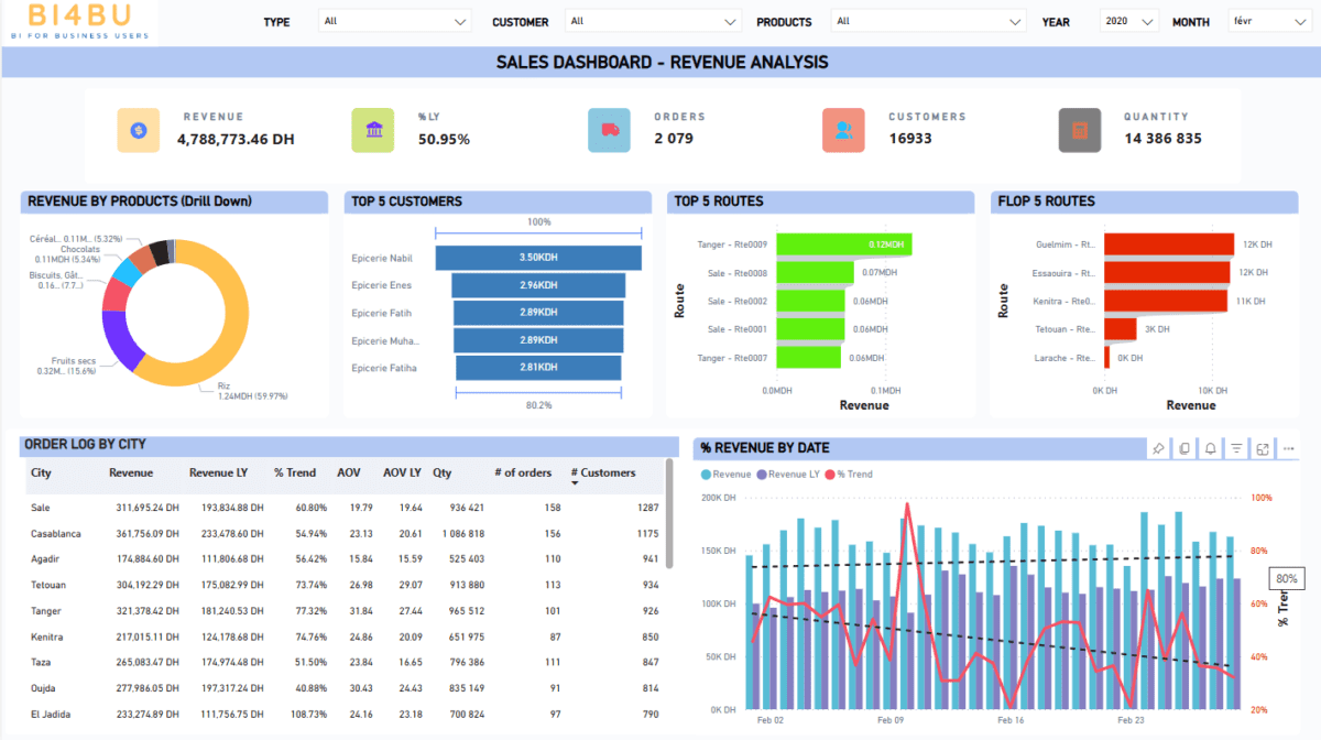
5. Clear Visualizations (Including Top and Flop Insights)
What Business Users Need
- Easy-to-understand charts that highlight trends, comparisons, and outliers.
- Clear identification of top performers (e.g., best-selling products) and flop performers (e.g., lowest-performing regions).
Most Accurate Visualizations
- Trends: Line Charts
- Ideal for showing growth or decline over time (e.g., monthly revenue trends).
- Comparisons: Bar Charts
- Best for comparing categories, such as sales across regions or product lines.
- Top and Flop Insights:
- Ranked Bar Charts: Display top 5 and bottom 5 performers in the same chart for quick analysis.
- Heatmaps: Highlight performance intensity, with colors representing high or low performance.
Why It Matters
- Visualizations make data easier to interpret, ensuring insights are actionable.
6. Data Context
What Business Users Need
- Numbers need context to be meaningful, such as comparisons to previous periods or benchmarks.
- Anomalies or significant changes should be explained.
Most Accurate Visualization
- Comparison Metrics with Annotations:
- Combine KPIs with annotations like “+15% from last month” or “Target: $1.5M.”
- Use bullet charts to show progress toward a goal (e.g., revenue achieved vs. target).
Why It Matters
- Context clarifies whether performance is good or bad and helps guide decisions.
7. Real-Time or Updated Data
What Business Users Need
- Clearly indicate when the data was last refreshed and whether updates occur in real time, daily, or weekly.
- Ensure data is current enough to support your decision-making.
Most Accurate Visualization
- Timestamp Indicators:
- Include a timestamp or update status (e.g., “Last updated: Dec 7, 2024, 9:00 AM”).
Why It Matters
- Prevents decisions based on outdated or irrelevant information.
8. Simple Navigation
What Business Users Need
- Easy-to-use navigation that ensures you can quickly find the data you need without confusion.
- Group sections logically with clear labels.
Most Accurate Visualization
- Tabbed Layout or Breadcrumbs:
- Use tabs to separate sections (e.g., “Sales,” “Marketing,” “Operations”).
- Breadcrumbs to show the user’s location within a multi-layered dashboard.
Why It Matters
- Reduces the time spent searching for information, improving efficiency.
9. Alerts and Highlights
What Business Users Need
- Instant visibility into issues or opportunities through alerts or highlights.
- Alerts should draw attention to significant deviations, achievements, or thresholds.
Most Accurate Visualization
- Conditional Formatting with Icons or Colors:
- Red for underperformance, green for meeting/exceeding targets.
- Icons or markers (e.g., ⚠ for anomalies, ✓ for on-target metrics).
Why It Matters
- Alerts ensure timely actions on critical data points.
10. Sharing and Export Options
What Business Users Need
- Ability to export reports or share data with colleagues in formats like PDF, Excel, or links.
- Support for collaboration and presentation needs.
Most Accurate Visualization
- Export and Share Buttons:
- Visible options for exporting charts or reports.
- Links for sharing specific dashboard views directly with colleagues.
Why It Matters
- Encourages team alignment and ensures accessibility of insights.
11. Security and Access
What Business Users Need
- Assurance that you see only the data relevant to your role.
- Protect sensitive information from unauthorized access.
Most Accurate Visualization
- Role-Based Views:
- A dashboard personalized to your role, limiting access to irrelevant or confidential data.
Why It Matters
- Builds trust in data security while keeping the dashboard focused on your needs.
Summary for Business Users
An effective dashboard should:
- Provide clear insights into the most critical metrics.
- Use intuitive visualizations like KPI cards, line charts, bar charts, and heatmaps.
- Offer interactivity, such as filters and drill-downs, for personalized exploration.
- Include context, alerts, and real-time updates to support timely, informed decisions.
- Facilitate sharing and ensure data security tailored to your role.
By leveraging these components and visualizations, you can quickly extract insights, identify opportunities, and address issues with confidence and efficiency.